A web site's navigation is vitally important. It is how people navigate around your web site quickly and easily. A common practice is to also add contact details or a search text box in the navigation too. This allows people to quickly search or get in contact with you, and it is visible on every page.
When you have a relatively small web site with only a handful of pages, the navigation bar can be simple and uncluttered. But when you add more and more pages, things get a little more hectic. Do you reduce the spacing between your navigation items to fit them all in horizontally? Or do you use a dropdown menu system that gives you a second level of menu items. These are great ideas but they come with their own problems too. Then what do you do at smaller screen sizes? How does your navigation look on a mobile or tablet device?
Making a navigation bar responsive means changing the layout so that it is still easy to use on a variety of devices. I have traditionally used a third-party library like Bootstrap to give me easy control of the responsive nature of my navigation. But third-party libraries can be quite heavy and slow down my site because they include many more files than I need and carry with them functionality which is not always needed. Additionally, these libraries usually incorporate javascript into the solution in order to add or remove CSS which, in turn, shows or hides elements.
I have previously built a full-screen menu which is one way to resolve this problem. This solution, however, is entirely CSS and uses the power of flexbox.
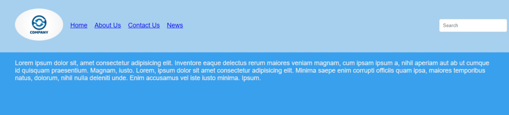
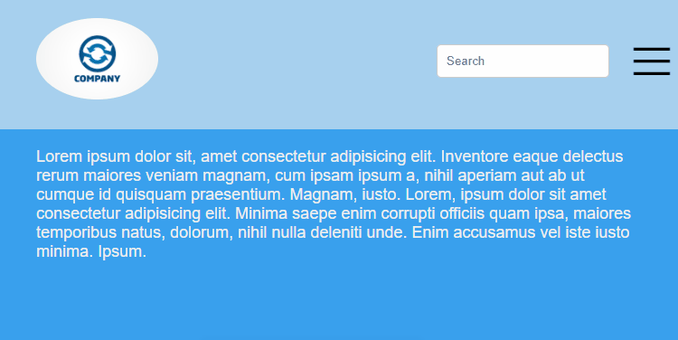
The basic premise behind this solution is using flexbox to change the order of elements based on breakpoints (screen size). For example, the image above shows a navigation as it appears on a wide desktop screen. But when you are viewing on a smaller screen, there is not enough horizontal room for the navigation items, so we need to collapse the navigation and bring in the "hamburger" menu.
The tricky thing here though is how to show and hide navigation items based on the hamburger menu state. If it has been clicked, we want to show the hidden items and show a close icon instead of the hamburger. If the menu is closed, we want to hide the items again and return the icon to the hamburger state.
Well I have done that using a checkbox and label. The hamburger icon is in a label which is bound to a checkbox. Then depending on the state of the checkbox, I apply styles to the necessary elements. Quite simple really.
I accept that this introduces additional HTML for the sake of it, but I think the trade-off in not requiring an additional javascript resource file makes up for that.
Check out the codepen for the full solution.
See the Pen Collapsible responsive navigation menu using only CSS - No Javascript required by Woolston Web Design (@woolstonwebdesign) on CodePen.light